Property Grid Options
Lets you define the look and feel of how the properties display in the Placement dialog when you place an OpenPlant Support Engineering support component. This includes how the different sections are laid out, the display of grid lines, image display etc.
Accessed by selecting the Property UI Settings icon from the Class Browser Tool ribbon.
The dialog has four tabs each described in the sections below.
Property
This tab defines the basics of how the properties in the Placement dialog are organized and displayed. The options let you decide whether or not to display grid lines and whether the properties are displayed in a flat view (ungrouped), or if they are categorized. By default, the options are set as follows:
The table below will detail each option: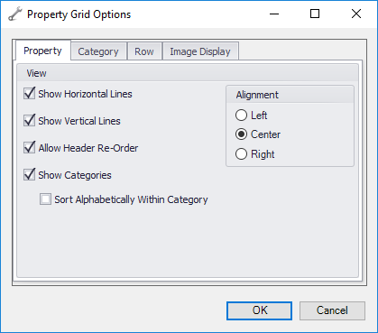
Example
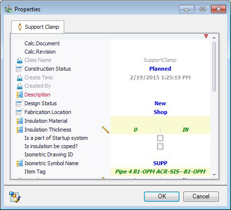
The image on the left below displays how the Properties dialog displays with the default settings as opposed to the image to the right in which the default options have been disabled. Notice the property fields are displayed in a flat view with no categories such as Project Identity, Catalog etc. to distinguish the groups. Also notice the grid lines are not present in the right image.

Category
The options in this tab control how the information in the categories are displayed.
The table below will detail each option:
Row
These options help to define how the property values in a grid row are displayed.
The table below will detail each option: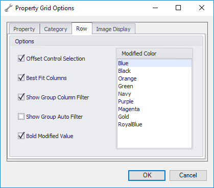
| Setting | Description |
|---|---|
| Offset Control Selection | When a grid is shown in the Properties dialog, it not displayed over the Property items, but instead offset to the side as shown below. |
| Best Fit Columns | This option sizes the column widths in the grid which best fits the value with the most characters. |
| Show Group Column Filter | Filter area under each column header where you can enter a value to use to filter the column. |
| Show Group Auto Filter | Filter area under each column header where you can enter a value to use to filter the column. |
| Bold Modified Value | When this option is enabled, whenever you make a change to a value in the Properties dialog, the modified value will display in bold font. |
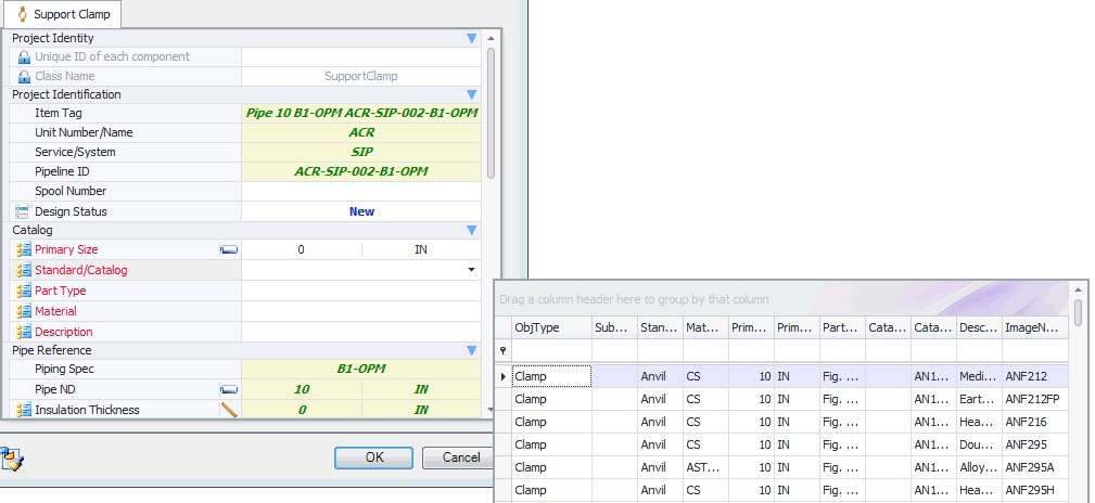
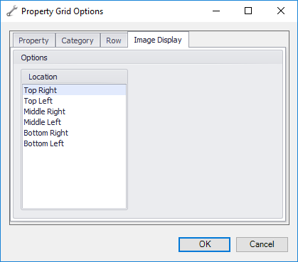
Image Display
If an image is to be included in the placement dialog for certain components, the location options determine where it will be displayed.
Once all of the Property Grid Options have been defined, click OK to apply the changes. The changes will be applicable in the next OpenPlant Support Engineering modeling session.